Respondents taking your survey can navigate through the questionnaire using the below ways:
Learn more: Question types supporting the auto-advance feature
Learn more: Question types supporting the back button
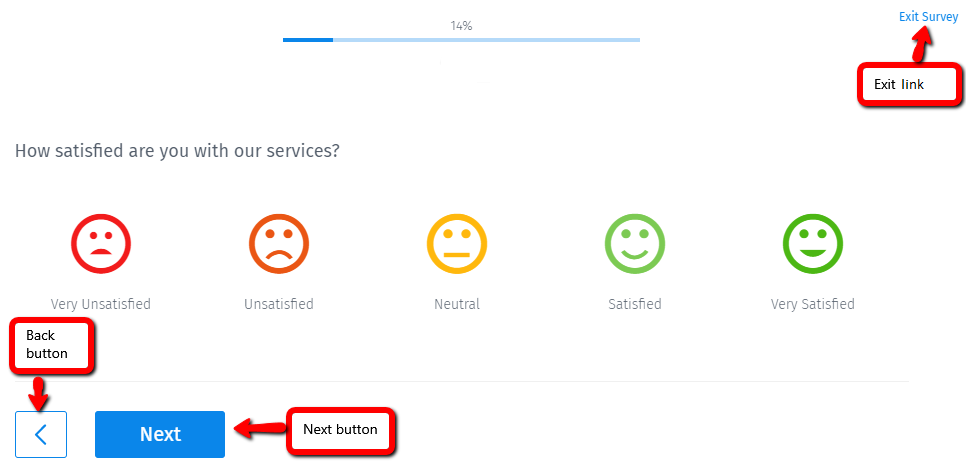
Exit: This link allows respondents to exit the survey without saving the responses entered on the current page. It is located at the top right corner of the page. You can also direct the users to a specific URL when they click the 'Exit Survey' link.
Next: Survey takers may want to skip a question and move on to the next. This navigation button takes the respondent to the next page of the questionnaire. It is visible at the bottom of the page, and users can customize the text of the button. It is enabled by default and cannot be disabled.
Finish: This button submits the survey and saves the response as 'Complete' in the system. It is located at the bottom of the last page, enabled by default, and cannot be disabled.
Respondents should not use browser navigation buttons to move through the survey. Survey admins can change the color of the submit button and theme to match their brand voice.
Example of navigation buttons in a survey
Consider the below sample customer feedback survey. Respondents answering this questionnaire can use the back button to go to the previous question or page. The next button will take them to the next page. Clicking on the 'Exit Survey' link will exit the survey. If any exit URL is configured, then the system will navigate them to that website, else they will see a Thank You page.

Uses of navigation buttons in a survey
Navigation: As the name suggests, these buttons let respondents navigate through the survey, thereby easing their experience of taking a survey.
Branded surveys: You can use buttons and links in the survey to create branded surveys. Change the color, font, and overall theme to reflect your brand style.
Advantages of using navigation buttons in surveys
User-friendly: These buttons improve the experience of taking a survey. They are quite intuitive and user-friendly for the respondents while they answer the questions.
Reduces drop-out rate: Placing navigation buttons at the right place in surveys is critical to collecting high-quality data and reducing the burden on survey participants. Allowing respondents the freedom to move through the questionnaire as they want significantly reduces the drop-out rate. They feel more driven to complete the survey and thus aid in the research study.
How to set up the navigation buttons in your surveys?
Learn how to set up and use this feature with our help file on back and exit navigation buttons.
Survey Software Easy to use and accessible for everyone. Design, send and analyze online surveys.
Research Suite A suite of enterprise-grade research tools for market research professionals.
Customer Experience Experiences change the world. Deliver the best with our CX management software.
Employee Experience Create the best employee experience and act on real-time data from end to end.


